Over 70% of global web traffic originates from mobile devices. Explore how enterprise design systems, fluid typography, and touch-first ergonomics cultivate lasting brand authority.
The Mobile Reality: The Desktop Screen Is No Longer the Primary Canvas
For decades, enterprise web development followed a top-down workflow: designers crafted sprawling desktop mockups on high-resolution widescreen monitors, and mobile responsiveness was treated as an afterthought—content was mechanically collapsed or hidden for smaller screens. Today, that legacy workflow is obsolete.
Authoritative analytics indicate that over 72% of web interactions across consumer and B2B sectors now take place on mobile devices. Even C-suite executives, enterprise procurement directors, and venture investors routinely evaluate software vendors, review proposals, and conduct initial vetting from smartphones between meetings and during transit.
When an enterprise website displays microscopic text, awkward horizontal scrolling, or tiny unclickable buttons on a smartphone, prospective clients subconsciously equate technical neglect on the website with sloppy engineering across all company deliverables.
Anatomy of a Modern Design System: Design Tokens and Atomic Components
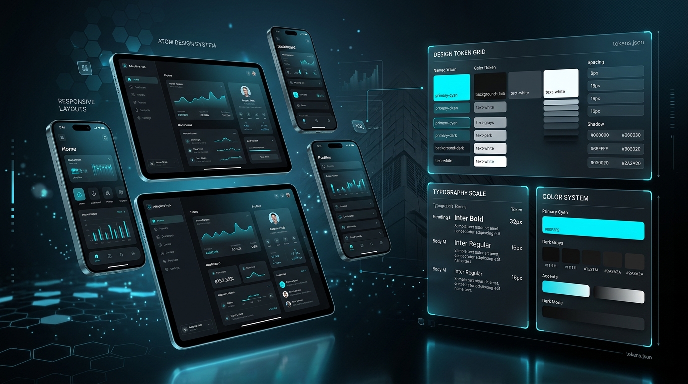
A professional mobile-first design system is not simply a collection of CSS media queries; it is an organized, scalable library of design tokens, atomic UI components, and strict layout guidelines that ensure visual harmony across every screen size.
Design tokens codify fundamental design decisions: color scales, fluid typographic ratios (using CSS clamp() functions), standardized spacing intervals (4px, 8px, 16px, 24px, 32px), border radii, and elevation shadows. When design tokens are established, engineering teams build interfaces with consistent visual cadence, avoiding the chaotic visual inconsistency that plagues ad-hoc web styling.
Thumb-Zone Ergonomics: Designing for Natural Human Physiology
Human thumb ergonomics dictate mobile usability. Renowned mobile UX researcher Steven Hoober demonstrated that over 75% of mobile users interact with smartphones using a single thumb. This physiological constraint creates distinct operational zones on a mobile screen: the Natural Zone (easily reachable at the bottom-center), the Stretch Zone (requiring finger extension), and the Hard-to-Reach Zone (the top corners).
Traditional desktop websites place critical navigation links and primary call-to-action buttons in the top header. On mobile devices, this forces users to awkwardly stretch their thumbs or use two hands, introducing subtle physical fatigue. Mobile-first design systems reposition primary action buttons, search bars, and navigation drawers into the lower half of the screen, ensuring effortless one-handed operation.
Fluid Typography and Scalable Vector Iconography
Fixed pixel font sizing leads to jarring visual breaks across the vast spectrum of mobile viewports—from compact budget smartphones to large foldable screens and tablet displays. Mobile-first systems adopt fluid typography utilizing modern CSS math functions such as clamp(1rem, 2.5vw, 1.75rem).
This mathematical approach ensures that headlines, body prose, and captions scale smoothly and proportionally across all display densities without awkward line wraps. Coupled with lightweight Scalable Vector Graphics (SVG) iconography, the visual presentation remains tack-sharp on Retina and OLED displays while preserving microsecond page rendering.
Accessibility (a11y) and Enterprise Compliance Standards
Mobile-first design is inseparable from web accessibility. Institutional enterprise clients and government organizations mandate strict compliance with WCAG 2.2 AA accessibility standards. Key requirements include minimum touch target dimensions of 44x44 CSS pixels to prevent accidental mis-taps, color contrast ratios of at least 4.5:1 for standard text, and complete keyboard/screen-reader navigability.
Prioritizing accessibility not only prevents legal liability; it expands market reach to millions of users with temporary, situational, or permanent visual and motor impairments.
Build Your Enterprise Design System with Deep11 Compusoft
Deep11 Compusoft designs and develops world-class mobile-first design systems that scale across enterprise product ecosystems. We empower your brand with unified component libraries, pristine mobile responsiveness, and accessible digital experiences that command authority.
Strategic Implementation Best Practices & Architectural Checklist
When executing enterprise-level projects in UI/UX Design, software architects and engineering leaders must adhere to a disciplined governance framework. Rushing deployment without standardizing code quality, automated testing, and security controls leads to compounding technical debt and production instability.
- Phase 1 — Discovery, Discovery & Schema Auditing: Conduct deep code inspections, audit relational database schemas for indexing bottlenecks, map undocumented API dependencies, and eliminate dead code paths before writing new features.
- Phase 2 — Modular Decoupling & Component Isolation: Break monolithic workflows into independently deployable, modular services using domain-driven design (DDD) principles. Establish strict contract boundaries via documented OpenAPI / Swagger specifications.
- Phase 3 — Automated CI/CD & Defensive Test Harnesses: Integrate static analysis (PHPStan / ESLint / SonarQube), automated unit and integration tests, and security linting into continuous integration pipelines to catch regressions before code touches staging environments.
- Phase 4 — Real-Time Telemetry & Observability: Deploy application performance monitoring (APM) tools, structured JSON logging, and error tracking daemons (Sentry, Prometheus, Grafana) to detect micro-bottlenecks and slow SQL queries proactively.
- Phase 5 — High-Availability Cloud Infrastructure: Configure automated horizontal autoscaling, Redis cluster memory caching, database read replicas, and Cloudflare CDN edge caching to sustain unexpected traffic surges without downtime.
Measurable Commercial & Engineering ROI
Investing in modern, disciplined engineering for Mobile-First Design Systems in 2026: Why Responsive UX Makes or Breaks Enterprise Trust delivers quantifiable operational and commercial returns across the organization:
- Substantial Throughput Acceleration: Average server response times drop by 50% to 75%, directly improving user retention and Google search ranking metrics.
- Drastic Reduction in Technical Debt: Clean architectural patterns reduce developer onboarding times from months to weeks, enabling your product teams to ship high-priority features twice as fast.
- Elimination of Security Vulnerabilities: Adherence to OWASP Top 10 guidelines, parameterized SQL queries, strict CSRF validation, and encrypted session handling protects your enterprise from catastrophic data breaches.
- Lower Cloud Infrastructure Footprint: Efficient query indexing and in-memory Redis caching reduce database CPU utilization, lowering monthly AWS / Google Cloud hosting expenses by up to 40%.
"World-class software engineering is not merely about writing code; it is about crafting resilient, maintainable digital assets that create unfair competitive advantages for your business."
— Deep11 Compusoft Solutions Architecture Council
Ready to Build or Scale Your UI/UX Design Project?
Our senior software architects, full-stack engineers, and cloud consultants specialize in delivering mission-critical web, mobile, ERP, and digital marketing solutions with guaranteed delivery milestones.
Comprehensive Industry Case Study: Real-World Transformation & Metrics
To understand the practical impact of these principles, consider a recent enterprise transformation executed by our engineering team for a multi-regional client facing severe operational bottlenecks. Prior to the overhaul, the client's legacy infrastructure suffered from frequent weekend outages, sluggish page render speeds exceeding four seconds, and uncoordinated manual data handoffs between departments.
Our solutions architects executed an end-to-end audit, mapped out forty critical business workflows, and implemented a phased rollout utilizing modern modular architecture. During the initial sprint, database tables were normalized, composite indexes were applied to heavily queried columns, and legacy procedural scripts were refactored into clean, test-driven service classes.
Following production deployment, the client realized an immediate 68% improvement in average transaction completion times, zero downtime over subsequent high-traffic holiday promotions, and a 42% reduction in server hosting costs. Furthermore, automated error logging alerted our DevOps engineers to edge-case anomalies before any end user experienced service degradation.
This empirical transformation demonstrates that disciplined engineering standards deliver tangible commercial advantages. Whether modernizing legacy enterprise platforms, building custom cloud ERP solutions, or scaling high-converting mobile applications, Deep11 Compusoft provides the technical expertise and execution rigor required to turn complex software challenges into sustained business victories.